Why finance says “bridge”, and what a bridge is meant to prove
A bridge chart is a waterfall chart used as a reconciliation: it starts at one reported figure, adds or subtracts one named driver per bar, and lands exactly on a second reported figure. Excel calls the chart type Waterfall. Finance calls the artefact a bridge, because of what it is for; it bridges from one agreed number to another agreed number and attributes every unit of the gap to a named cause.
A waterfall will render any list of numbers. A bridge is an argument with two fixed endpoints. FY24 EBITDA was 182.0 and FY25 EBITDA was 208.8; nobody will re-litigate those. What is in dispute is the 26.8 in between. Three consequences follow, and they are the whole discipline:
- The bars must sum exactly to the difference. Not approximately. A bridge with a rounding gap is a bridge with an argument gap, and it will be found.
- Every bar must be a cause, not a category. “Europe” is not a driver of EBITDA; “European price realisation” is. A bar that cannot be traced to a decision, an event or a market movement is a slice, not a driver.
- The drivers must be mutually exclusive. If price and mix both partly capture the same customer switching to a cheaper SKU, you have double-counted; and the total still ties, because something else absorbed the error.
A chart failing all three still looks exactly like a bridge. That is why they get through.
Anchor
Start from a stated baseline.
Explain
Give each driver a signed value.
Reconcile
End exactly where the numbers do.
The template collection
Six ways to tell the story.
Editable PowerPoint slides and downloadable PDF previews. Choose a layout, then make it your own.
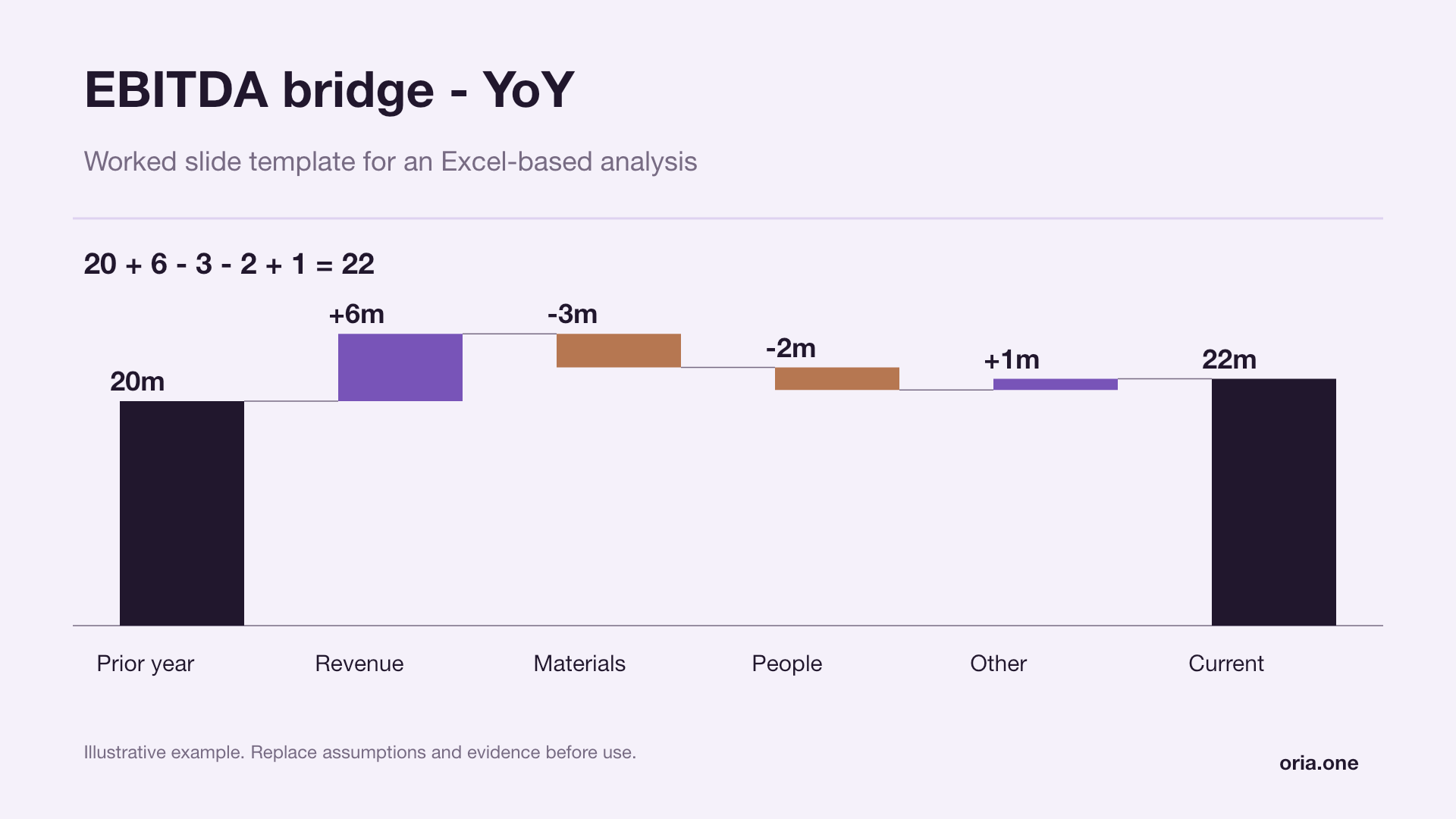
EBITDA bridge - YoYLilac editorial
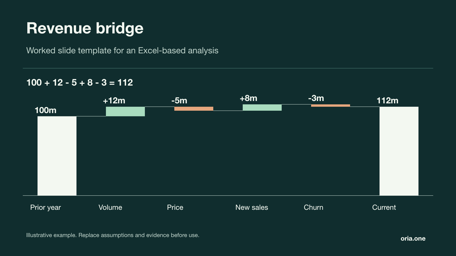
Revenue bridgeMidnight mint
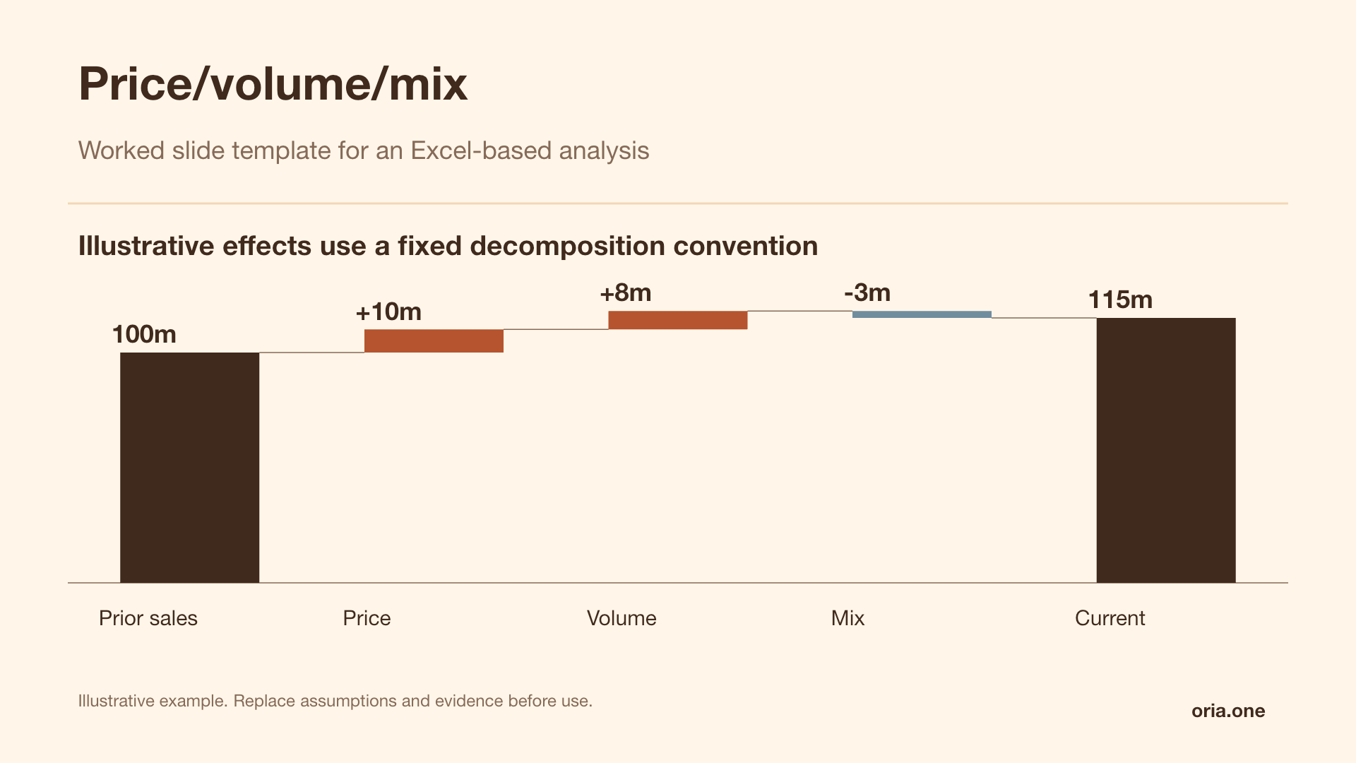
Price/volume/mixWarm studio
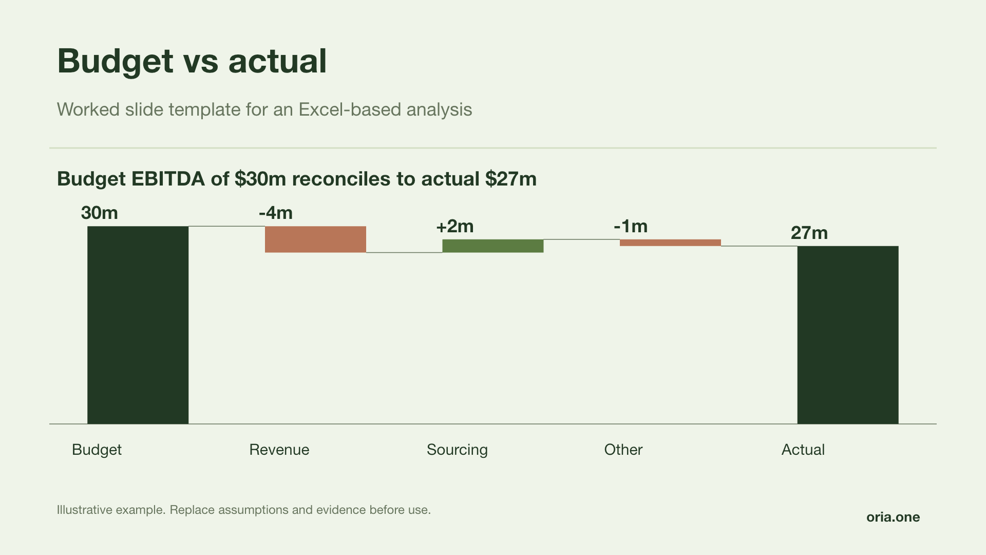
Budget vs actualForest report
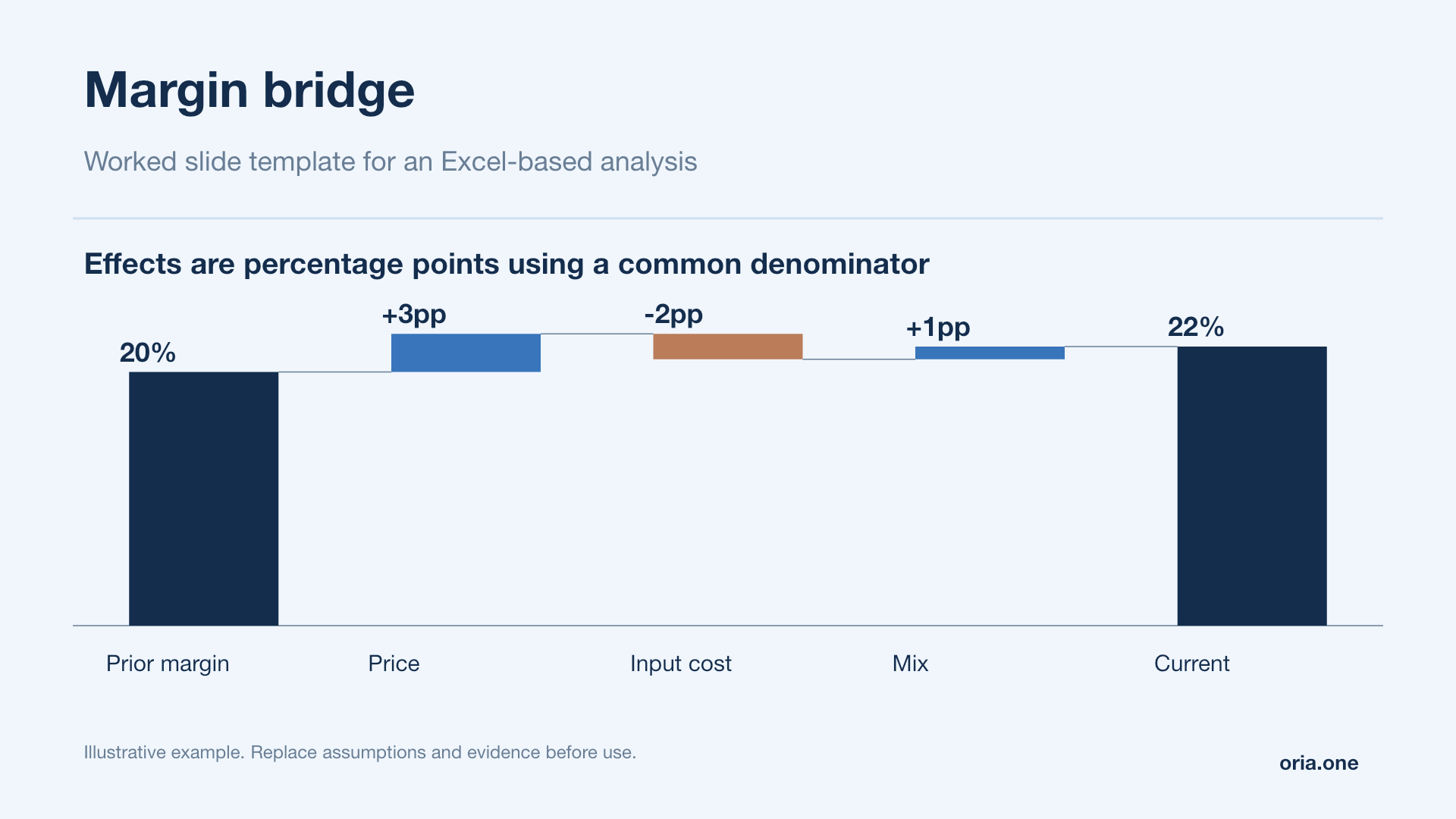
Margin bridgeBlue analysis
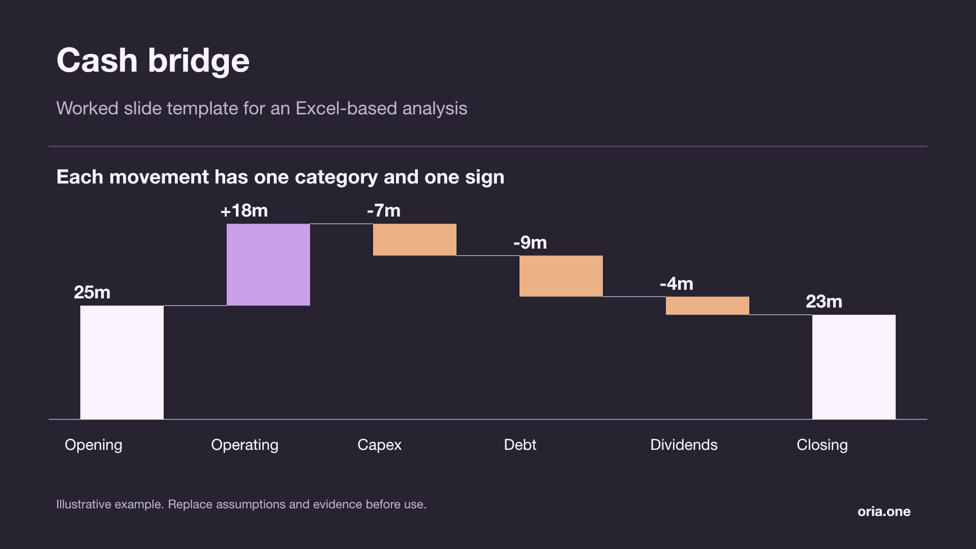
Cash bridgeGraphite orchid
Illustrative examples. All slide text and chart shapes are editable; replace sample values with your own analysis.
The six bridges a finance team actually builds
You are never building “a bridge chart”. You are building one of a small number of recognised artefacts, each with its own endpoints, driver vocabulary and failure mode. Knowing which one you are in tells you what the reviewer will attack.
| Bridge | Reconciles | Typical drivers | The hard part |
|---|---|---|---|
| Revenue bridge | Prior-period revenue → current revenue | Price, volume, mix, new business, churn, FX, M&A | Separating mix from volume once you aggregate above SKU level |
| EBITDA bridge | Prior EBITDA → current EBITDA | Gross-margin drivers, productivity, opex investment, one-offs, FX, M&A | Staying additive when volume and unit margin both move at once |
| Margin bridge | Prior margin % → current margin % (in points or bps) | Price, input cost, mix, plus a denominator effect | Percentages do not add; you need an explicit identity (below) |
| Cash flow bridge | Opening cash → closing cash, or EBITDA → free cash flow | EBITDA, working capital by component, capex, tax, interest, financing | Sign conventions: a receivables increase is a cash outflow |
| Budget vs actual variance | Budget → actual for the period | Volume, price, rate, spend level, phasing | Splitting genuine variance from timing that reverses next month |
| Price/volume/mix | Prior revenue → current revenue at driver level | Price, volume, mix, and the joint term between them | Choosing a decomposition convention; and disclosing it |
The cash bridge is the only one whose bar order is fixed for you: it follows the cash flow statement, and reordering it to look tidier costs more credibility than it is worth.
How to read a bridge, in the order a reviewer reads it
Experienced readers do not read a bridge left to right. They read it in this order; so this is the order in which to make things unmissable.
- The two anchor columns. First and last, grounded on the axis, neutral colour. These get checked against the reported numbers before anything else; if they do not match the P&L to the decimal, the rest of the slide is dead.
- The delta. Stated once, in the title. Everything in the middle explains this one figure.
- The largest bar. The one you will be asked about first, so label it with a decision or an event, not a ledger line.
- The negative bars. Distinctly coloured. People scan for what went wrong before reading what went right.
- The connectors. The dotted lines carrying each running total to the next bar. Without them a bridge reads as stacked columns and invites the wrong question.
- The “other” bar. Last, and hardest. Its size sets the credibility of everything to its left.
Two encoding rules follow. Label bars with the delta, not the running total; a bridge that labels levels has thrown away its reason to exist. And keep the sign in the label, so the slide survives greyscale printing and colour vision deficiency.
A worked EBITDA bridge that ties
An illustrative year-on-year EBITDA bridge for a fictional mid-market manufacturer. The figures are constructed for this example; they are not any real company's results; but they are internally consistent: the eight driver bars sum to 26.8, exactly the gap between the endpoints. Currency is millions of euros.
| Step | Driver | Effect | Running | What it represents |
|---|---|---|---|---|
| , | FY24 EBITDA (reported) | , | 182.0 | Anchor; ties to the FY24 statutory accounts |
| 1 | Volume | +24.6 | 206.6 | Incremental units at prior-year unit margin |
| 2 | Price | +38.4 | 245.0 | Realised price increases at current-year volume |
| 3 | Mix | −7.1 | 237.9 | Shift of demand toward lower-margin SKUs |
| 4 | Input cost | −31.5 | 206.4 | Resin, freight and energy inflation, net of hedges |
| 5 | Productivity | +12.8 | 219.2 | Booked savings from the two-plant consolidation |
| 6 | SG&A investment | −14.2 | 205.0 | Deliberate build-out of the direct sales team |
| 7 | FX translation | −5.6 | 199.4 | Non-operational; USD and MXN translation only |
| 8 | M&A | +9.4 | 208.8 | Four months of the Q3 bolt-on acquisition |
| , | FY25 EBITDA (reported) | , | 208.8 | Anchor; ties to the FY25 statutory accounts |
Note the ordering: operating drivers first, revenue-side then cost-side, with the two non-operational bars (FX and M&A) held right so they do not interrupt the operating story.
Two details are deliberate. The axis is truncated at 160 with the break marked: zero-based, the −5.6 FX bar would render as two pixels, and truncating is honest provided you mark it and label every bar. And the title states the conclusion; a bridge titled “FY24 to FY25 EBITDA Bridge” has wasted the most valuable line on the slide.
Bridging the margin percentage, where the bars genuinely do not add
The usual follow-up is the same picture in margin points, and this is where models start fudging: percentages are not additive, so you cannot simply divide each bar by revenue. There is an exact identity. With E for EBITDA and R for revenue:
m₁ − m₀ = Σ(Dᵢ / R₁) + E₀ × (1/R₁ − 1/R₀)
Each EBITDA driver Dᵢ contributes Dᵢ / R₁ points, and one extra bar; the denominator effect; captures the dilution from growing the revenue base.
Applied to the worked example, with revenue of 1,310.0 in FY24 and 1,486.0 in FY25, margin moves from 13.89% to 14.05%; a gain of just 15.8 bps. The eight drivers contribute +180.3 bps; the denominator effect subtracts −164.5 bps. That single bar is the entire explanation for why EBITDA grew 14.7% while margin barely moved, and omitting it is how margin bridges end up with a large unexplained plug.
Price, volume and mix; the part most bridges get wrong
This is the hardest decomposition in the discipline, and where bridges are quietly, confidently incorrect. Price, volume and mix are not three independent facts sitting in a system somewhere: they are the output of a convention you choose, and different conventions give different answers; all of which tie. The whole problem is visible in the underlying data.
| SKU | Q₀ | P₀ | Revenue₀ | Q₁ | P₁ | Revenue₁ |
|---|---|---|---|---|---|---|
| Core | 1,200 | 10.00 | 12,000 | 1,500 | 10.50 | 15,750 |
| Premium | 400 | 30.00 | 12,000 | 380 | 31.50 | 11,970 |
| Total | 1,600 | 15.00 | 24,000 | 1,880 | 14.74 | 27,720 |
Revenue is up 3,720. Units are up 17.5%. Every list price went up 5%. Yet blended average selling price fell, from 15.00 to 14.74, because the cheap SKU grew and the expensive one shrank. Anyone deriving price from blended ASP therefore reports a price effect of −480 in a year the company raised prices on everything it sells. That is a mix effect wearing a price label, and it has been presented to boards.
The standard decomposition, and why the residual moves
With SKU-level price and quantity, decompose per SKU and sum. Mix then needs no separate bar; it is already inside the per-SKU volume figures. The remaining choice is the joint term Σ(ΔP × ΔQ), here +120. Three defensible per-SKU conventions, all tying exactly to 3,720; shown below alongside the two aggregate approaches:
| Convention | Volume | Price | Mix | Total |
|---|---|---|---|---|
| Per-SKU, prior price; volume at P₀, price at Q₁ | 2,400 | 1,320 | , | 3,720 |
| Per-SKU, current price; volume at P₁, price at Q₀ | 2,520 | 1,200 | , | 3,720 |
| Per-SKU, midpoint (Marshall–Edgeworth) | 2,460 | 1,260 | , | 3,720 |
| Aggregate ASP with an explicit mix bar | 4,200 | 1,320 | −1,800 | 3,720 |
| Naive aggregate ASP, no mix bar | 4,200 | −480 | , | 3,720 |
That table is the whole lesson. The price bar is 1,200, 1,260 or 1,320 depending purely on which of three equally standard conventions you picked; a spread of 120, 3.2% of the entire gap, decided by nothing but a modelling choice. The bottom row ties too, and is nonsense.
Hence the rule separating a professional bridge from an amateur one: state your convention on the slide. One footnote does it; “Price measured at current-year volumes; volume at prior-year prices; joint effect of +120 reported within price.” Analysts who omit it are not hiding the convention from the audience, only from themselves.
Two points hold across conventions. If a mix bar appears, define its level; SKU, customer, channel and geography mix are four different numbers. And when bridging gross profit rather than revenue, value volume at prior-year unit margin, not price, or the volume bar silently absorbs a margin effect.
Ordering, bar count, and the conventions that survive review
There are three defensible orderings, and the choice is rhetorical rather than technical.
- Start, positives descending, negatives descending, end. Tidiest and easiest to build. But it asserts no causal sequence, so it reads as a list rather than an argument; fine for an appendix, weak for a page you are presenting.
- Grouped by driver family. Revenue-side, then cost-side, then non-operational (FX, M&A, one-offs) pushed right; what the worked example does, and the right board-pack default. It lets you say “the operating business delivered +23.0; the remaining +3.8 is FX and the bolt-on”, which is the sentence the audience needs.
- Fixed by the statement. Cash bridges follow the cash flow statement; budget variance bridges follow the P&L order the budget holder is accountable for. Reordering these for aesthetics breaks the reader's model of a document they already know.
Whichever you choose, keep it constant across periods; the first thing a good CFO does is compare this month's bridge to last month's.
On bar count: five to seven driver bars is comfortable, eight is the ceiling, past nine the chart stops working. Labels collide, small bars fall below the threshold at which the eye can compare them, and the audience switches from attributing to skimming. The worked example uses eight deliberately and is at the limit; on a tighter slide, combine FX and M&A into one “non-operational” bar and footnote the split. Fifteen drivers is not a bridge, it is a table.
The tie-out, and the “other” bar where credibility dies
Before a bridge goes anywhere it gets two checks. The first is arithmetic and takes one cell:
= ROUND(End − Start − SUM(drivers), 6) must return 0. Put it in the workbook next to the driver list, formatted red when non-zero, and never delete it. Run it in the model's own units, before rounding for display.
The second check is substantive, and is the one that actually protects you: each driver must tie to a source. Volume to the units report, price to the realised-price extract, FX to a constant-currency run, productivity to the savings tracker; using the numbers the operations team reports against. A bridge claiming +12.8 of productivity while the programme office tracks 9.1 will be destroyed by whoever owns that programme, and rightly.
Which brings us to the bar nobody wants to discuss. “Other” is where credibility dies. Size it against the gap, not the base: an “other” of 2.0 against a 26.8 gap is 7.5% of your explanation unattributed, and that is the number the reviewer computes; not 2.0 against 208.8. Above roughly 10% of the gap the bridge is not ready, because the residual can then plausibly outrank several named drivers. And never let “other” be a plug you did not compute: if it exists only because the numbers would not otherwise tie, it is not a driver, it is an error with a label.
Arrive with three things ready and you will rarely be caught out: the source for the largest bar, the convention behind price/volume/mix, and an honest account of what sits in “other”. Those are the three questions, in that order, in every serious review.
What the Excel file behind the bridge should contain
However you draw it, the workbook should hold four things: a driver table with one row per bar and an explicit sign; a running-total column computed from the drivers rather than typed; the tie-out formula above; and a convention-flag cell naming the decomposition, which the slide footnote reads from. Get those right and the chart itself is mechanical.
When not to build a bridge
A bridge is the wrong artefact more often than its popularity suggests.
- When the endpoints are not causally linked. Bridging your margin to a competitor's margin looks compelling and is invalid: the bars are differences in circumstance, and nothing in between is something anyone did.
- When the audience needs levels, not change. “How big is each business unit” is a bar chart or a Mekko question. A bridge answers “what moved”, and only that.
- When the drivers overlap. If you cannot state why two bars are mutually exclusive, the tie-out is masking a double count.
- When there are only two drivers. A three-bar bridge is a sentence dressed up as a chart. Write the sentence.
- When the movement is multiplicative. Compounding growth rates, blended yields and index changes do not decompose additively without an explicit identity like the margin one above.
The general test: if you cannot write the takeaway sentence; “EBITDA grew 26.8, of which pricing contributed 38.4 against 31.5 of input cost inflation”; the bridge has nothing to say. Bridges are cheap to draw and expensive to defend. Build the ones you can defend.
Frequently asked questions
Is a bridge chart the same thing as a waterfall chart?
Structurally yes; same floating bars, connectors and running total. “Waterfall” names the visual form; “bridge” names a finance artefact with two fixed, reported endpoints and a requirement that the bars reconcile the gap exactly. Excel calls the chart type Waterfall; a banker asking for a bridge is asking for a reconciliation, not a shape.
Does Excel's built-in waterfall chart handle subtotals and negative endpoints properly?
Mostly. Insert → Waterfall gives floating bars and connectors, and you ground the anchor columns by selecting a data point and choosing “Set as Total”. The limits: little control over connector styling, fiddly mid-bridge subtotals, and degradation in builds older than Excel 2016. Teams needing full control, or compatibility with Google Sheets, still build bridges as stacked columns with an invisible base series.
How do I guarantee the bars sum to the difference between the endpoints?
Put a live check in the workbook rather than eyeballing the chart: = ROUND(End − Start − SUM(drivers), 6), which must return zero, run in the model's native units before display rounding. The common failure is a model in thousands feeding a chart in millions, where a genuine 0.4 gap disappears into rounding and reappears the moment someone re-derives a bar.
Should price/volume/mix be calculated per SKU or at aggregate level?
Per SKU wherever the data allows, then summed. Deriving price from blended average selling price merges genuine price movement with mix and can invert the sign: in the worked example above, list prices rose 5% on every product while the naive aggregate method reports a price effect of −480. At aggregate level, break mix out as its own explicit bar rather than hiding it inside price.
How many bars is too many in a bridge?
Five to seven driver bars is comfortable, eight is the practical ceiling, past nine the chart stops doing its job: labels collide and the audience switches from attributing to skimming. With more real drivers, group the smallest into a named family; “non-operational”, “other cost programmes”; and footnote the split, or move to a two-level bridge.
How do I bridge a margin percentage when percentages don't add?
Use the exact identity rather than dividing each bar by revenue. With E for EBITDA and R for revenue, m₁ − m₀ = Σ(Dᵢ / R₁) + E₀ × (1/R₁ − 1/R₀): each driver contributes Dᵢ / R₁ points, plus one denominator bar capturing dilution from a larger revenue base. In the worked example, drivers add 180.3 bps and the denominator effect removes 164.5 bps, netting the 15.8 bps margin actually moved. Without that bar, margin bridges develop a residual nobody can explain.